On this page
All 41 charts
Click a chart to open its page
Bar9
Treemap1
Candle2
Pyramid1
Sankey1
Waterfall1
Parliament1
Waterfall family
Waterfall: Animated Bridge Chart for DaVinci Resolve
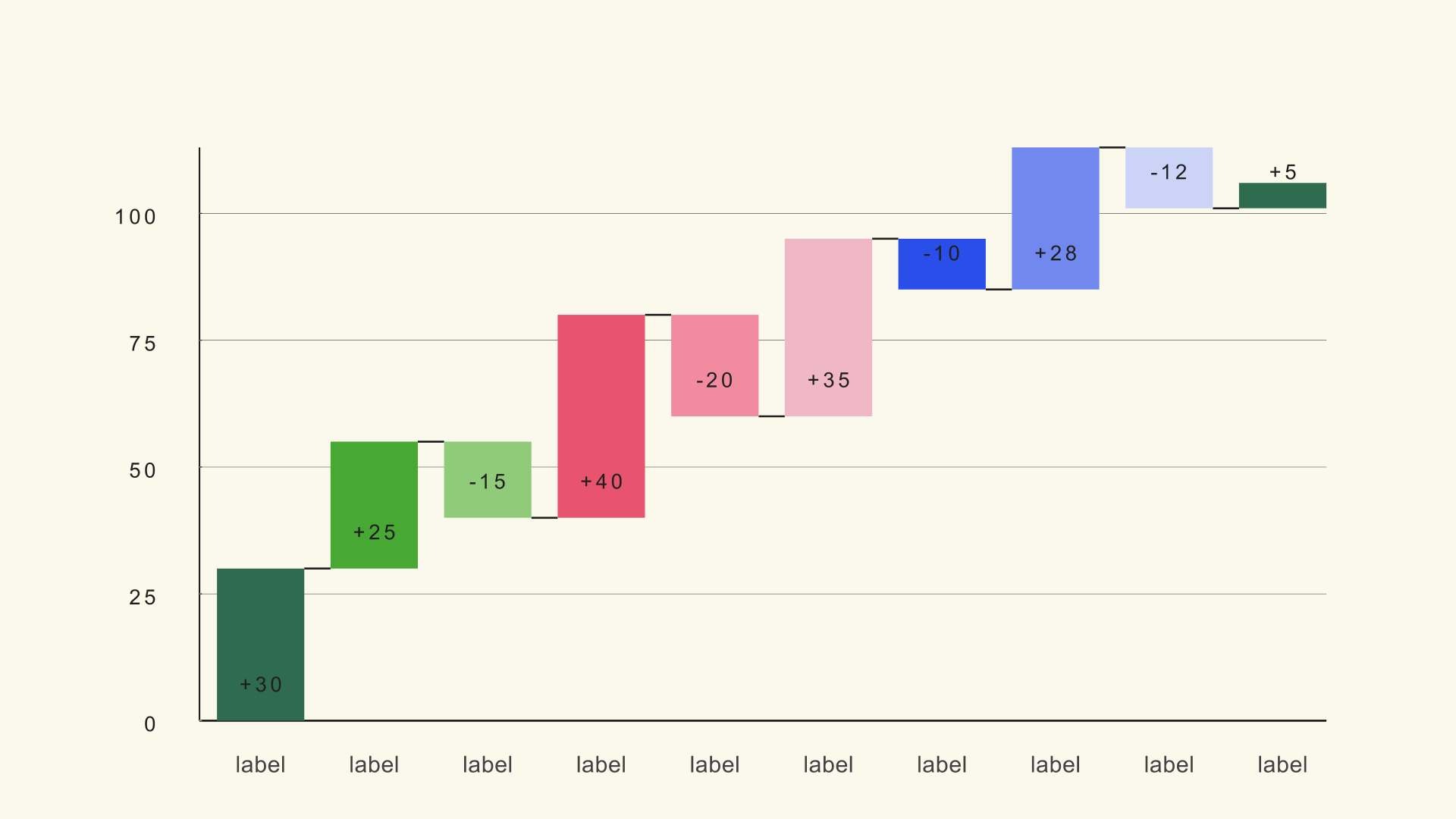
Waterfall turns a sequence of increases and decreases into a running-total bridge. It is the chart for explaining how a starting number becomes an ending number.
Updated November 2026By Noyris Charts TeamTested on DaVinci Resolve 18-21
79
controls
4
Inspector pages
100
bars
100%
Resolve-native
Chart guide
Each bar shows a delta from the previous level. Positive steps rise, negative steps fall, and optional summary bars span from the baseline to the running total. The value axis is level-based, so negative steps can sit below the baseline without breaking the chart.
Use it for profit bridges, budget variance, energy transitions or any story where the order of changes matters as much as the final number.
When to use Waterfall
Profit and revenue bridges
Start with revenue, subtract costs and taxes, then land on net profit. Total bars make the checkpoints obvious.
Budget variance
Show how planned spend becomes actual spend through a sequence of overruns and savings.
Energy or emissions transitions
Use negative and positive steps to show what changed between two years and which factors drove the difference.
Data format and sample file
The CSV uses label, delta and an optional total flag. A total flag above 0.5 turns that row into a summary bar.
Sample CSV
waterfall.csv
| Column | Type | What it holds |
|---|---|---|
| label | text | Step or summary name. |
| delta | number | Change from the previous level; negative values fall. |
| total | number | 1 marks a summary bar, 0 leaves it as a normal step. |
Set Total Column (0=none) to 2 after loading this file so the summary rows use the total style.
Synthetic sample data for layout testing - replace it with your own values before publishing.
Settings that make it look right
These are the controls worth setting first. Every value can be changed later on the chart's own Inspector pages below.
| Control | Start with | Why |
|---|---|---|
| Bars | 8 | Matches the sample and keeps every label readable. |
| Total Column (0=none) | 2 | Enables the summary rows in the sample file. |
| Show Connectors | On | Connects each level so the bridge reads as one sequence. |
| Chart Max | 100 | Fixes the top of the scale for the sample values. |
| Duration | 1.2 s | Gives the bridge time to build step by step. |
| Stagger (s) | 0.06 | Reveals the changes in order. |
Build it in DaVinci Resolve
1
Build the delta table
List the starting value as a normal delta, then each change, and mark the summary rows with a total flag. Keep the rows in the order you want them explained.
2
Load and mark totals
Load the CSV, set the Total Column to the flag column and check that the summary bars land on the correct running total.
3
Style the directions
Choose increase, decrease and total colors, turn connectors on and animate the bridge from left to right.
Look and feel
This is one of 41 native chart generators.
Get the full Noyris Charts pack for $59, one time.
Frequently asked questions
How do I create a total bar?+
Add a total flag column to the CSV, set Total Column to that index and put a value above 0.5 on the rows that should be summaries.
Can I show negative steps?+
Yes. Negative deltas drop below the previous level, and the level-based axis expands to fit them.
Does the waterfall start at zero?+
The first normal bar starts from the baseline. Summary bars span from the baseline to the running total at that point.
How many steps can I show?+
Up to 100 bars. For video, 6 to 10 steps is usually the clearest range.
Related chart guides
Quick start
- 1Drag the generator from Effects → Generators → Noyris Charts onto your clip.
- 2Enter your values in the Data page (or load a CSV).
- 3Adjust Layout to size and space the chart.
- 4Pick a theme or manual colors in Style.
- 5Check Animate and hit play - the grow-in, stagger and easing are built in.
Inspector reference
All four Inspector pages shown exactly as they look in Resolve · the panel on the left explains every control
Data
Noyris Charts by noyris.com
Bars
Bars
How many waterfall bars the chart draws.
Data Source (CSV File)
Point to a CSV file below. Rows load as label,delta[,total] (which CSV column is label vs delta is set by the Label/Value Column controls; the Total Column marks summary bars). A line starting with # and a space is a comment (other #-labels are data); the Header Row First option skips the first row. First row is a header (column names) Pick which CSV column is the bar label, which is the delta value, and which marks Total bars (0 = first column; Total Column 0 = none).
CSV File (optional)
Load a .csv to populate the chart in one click - rows are mapped per the column controls below.
Header Row First
Skip the first row when reading the CSV.
Label Column (0=first)
Which CSV column holds each bar's label.
Value Column (0=first)
Which column of the CSV file holds each row's delta value.
Total Column (0=none)
Which column of the CSV file marks summary bars. A row flagged as a total is drawn from the baseline to the running total.
Per-Bar Details× 100 bars
Visible
Shows or hides this bar.
Value
The value for this element. The chart scales it against Chart Max to set the size it draws.
Is Total
Renders this bar as a Total bar spanning baseline -> running total in the Total color.
Label
The text shown under this bar.
Bar Color
The color this row is drawn in.
Layout
Noyris Charts by noyris.com
Geometry & Card
Chart Position
Moves the plot inside the frame, away from the centre.
Chart Size
How much of the frame the plot fills, from a small inset to edge to edge.
Chart Max
The value at the right-hand end of the scale. Raising it shrinks every element against a bigger ceiling; lowering it exaggerates them.
Bar Width
Bar width as a share of its slot - how fat each bar is.
Bar Gap
Space between the elements inside one row. Turn it down to close the gap.
Bar Max Height
How tall the marker column can grow inside its row. Use it to stop crowded rows from colliding.
Rounded Corners
Rounds the corners of each element.
Axes & Grid
Show Connectors
Draw a connector across the gap at every running level so the bridge steps read as one sequence.
Show Baseline
Draw the zero baseline across the plot.
Show Y Axis
Draw the value axis line.
Y Axis Tick Marks
Draw small tick marks along the value axis.
Show Grid
Draw the background gridlines behind the plot.
Show Y-Axis Tick Labels
Print the scale numbers along the value axis.
Tick Label Size
Size of the axis scale numbers.
Y Tick Label Prefix
Text added in front of every axis scale number.
Y Tick Label Suffix
Text appended after every axis scale number.
Labels
Show Value Labels
Print each element's value next to it.
Show Category Labels
Print the element names along the category axis.
Value Label Size
Size of the printed value labels.
Category Label Size
Size of the printed category names.
Value Label Gap
Space between an element and its printed value.
Category Label Gap
Space between the plot edge and the category names.
Category Label Orientation
Rotation of the category names - flat, angled or upright.
Options: Horizontal, Vertical
Value Formatting
Number Format
How numbers are written - plain, with thousands separators, or as a percentage.
Options: Plain, Thousands, Compact (K/M/B)
Decimals
How many decimal places printed values keep.
Prefix
Text prepended to every printed value, such as a currency symbol.
Suffix
Text appended to every printed value, such as a unit.
Typography
Font
Typeface used for every label on the chart.
Style
Weight and slant of the chart's type.
Letter Spacing
The spacing between the letters in the labels.
Style
Noyris Charts by noyris.com
Apply Theme
Push the selected theme's palette, type and motion onto the chart in one step, then keep editing from there.
Theme
Theme
Choose one of the built-in color themes. It sets every color on the chart.
Background
Show Background
Draw the chart's own backing card behind the plot.
Background Color Mode
Choose whether the background color comes from the selected theme, or from the manual swatch below.
Options: Theme, Manual
Background Color
Color of the backing card.
Grid
Grid Color Mode
Choose whether the grid color comes from the selected theme, or from the manual swatch below.
Options: Theme, Manual
Grid Color
Color of the background gridlines.
Axis
Axis/Baseline Color Mode
Choose whether the axis/baseline color comes from the selected theme, or from the manual swatch below.
Options: Theme, Manual
Axis Color
Sets the axis color.
Increase
Increase Color Mode
Choose whether the increase color comes from the selected theme, or from the manual swatch below.
Options: Theme, Manual
Increase Color
How the increasing steps are colored - follow the theme, or use the manual swatch below.
Decrease
Decrease Color Mode
Choose whether the decrease color comes from the selected theme, or from the manual swatch below.
Options: Theme, Manual
Decrease Color
How the decreasing steps are colored - follow the theme, or use the manual swatch below.
Total
Total Color Mode
Choose whether the total color comes from the selected theme, or from the manual swatch below.
Options: Theme, Manual
Total Color
How the summary bars are colored - follow the theme, or use the manual swatch below.
Value Label
Value Label Color Mode
Choose whether the value label color comes from the selected theme, or from the manual swatch below.
Options: Theme, Manual
Value Label Color
Color of the printed value labels.
Y-Axis Tick Label
Y-Axis Tick Color Mode
Choose whether the y-axis tick color comes from the selected theme, or from the manual swatch below.
Options: Theme, Manual
Tick Label Color
Sets the tick label color.
Category Label
Category Label Color Mode
Choose whether the category label color comes from the selected theme, or from the manual swatch below.
Options: Theme, Manual
Category Label Color
Color of the printed category names.
Animation
Noyris Charts by noyris.com
Animate
Master switch for the entrance animation. Turn it off to render the finished chart immediately.
Animation Style
How the chart enters - drawn on, grown from the baseline, or faded up.
Options: Grow, Slide, Fade, Rise, Bounce, Elastic, Pop, Sweep
Stagger Order
The order elements come in: left to right, right to left, or smallest value first.
Options: Forward, Reverse, Center Out, Random
Start
When the animation begins, in seconds from the start of the comp.
Duration
How long the whole entrance takes, in seconds.
Stagger (s)
Wait added between each element's start, so they appear one after another.
Easing
How the entrance speeds up and slows down - steady, eased, or springy.
Options: Linear, Ease In, Ease In Out, Ease Out, Smooth, Back, Elastic, Bounce, Spring
Exaggeration
How far past its final position the first element overshoots on a spring entrance.
Settle
How many of the follow-through wobbles are shown before the value rests.
Label Animation
How the labels arrive - with their element, or after everything has settled.
Options: None, Fade, Pop
Clip Labels to Reveal
Keep each label hidden until its own element has grown past it.
Easing Curve
The shape of your custom acceleration curve for the entrance.
Options: None, Snappy, Soft, Liquid
Custom Progress Curve
Replaces the built-in easing with the curve you shape below.
Options: Disabled, Custom
Handle 1 X
Horizontal position of the first curve handle - the ease-in side.
Handle 1 Y
Vertical position of the first curve handle - the ease-in side.
Handle 2 X
Horizontal position of the second curve handle - the ease-out side.
Handle 2 Y
Vertical position of the second curve handle - the ease-out side.
All 41 charts
Bar
Treemap
Candle
Pyramid
Sankey
Waterfall
Parliament