All 41 charts
Click a chart to open its page
Bar9
Treemap1
Candle2
Pyramid1
Sankey1
Waterfall1
Parliament1
Bar family
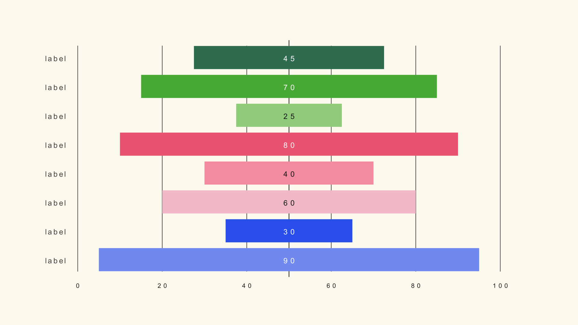
Bar Diverging
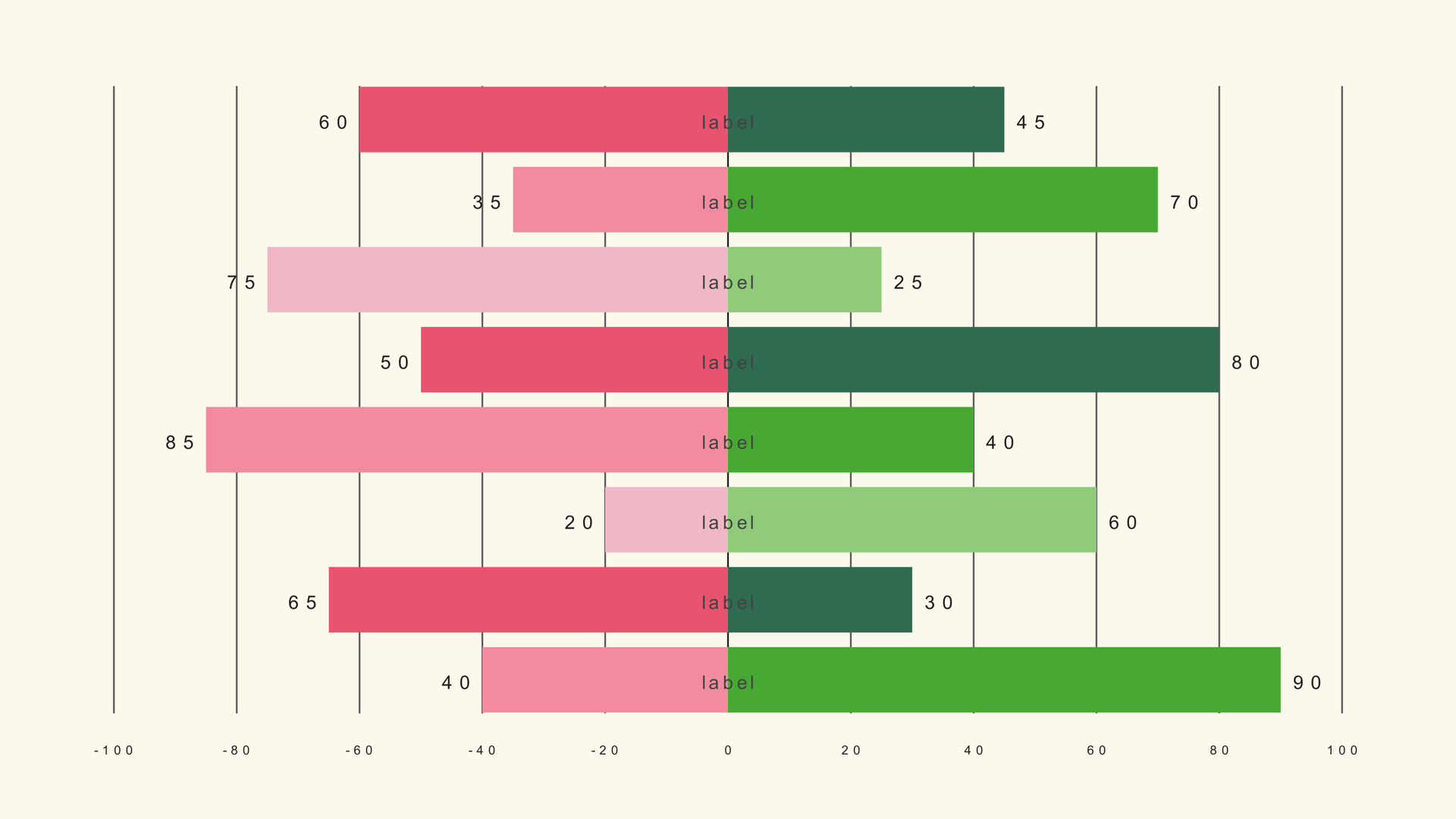
Noyris diverging horizontal bar chart generator (up to 100 bars).
Updated November 2026By Noyris Charts TeamTested on DaVinci Resolve 18-21
73
controls
4
Inspector pages
100
bars
100%
Resolve-native
Quick start
- 1Drag the generator from Effects → Generators → Noyris Charts onto your clip.
- 2Enter your values in the Data page (or load a CSV).
- 3Adjust Layout to size and space the chart.
- 4Pick a theme or manual colors in Style.
- 5Check Animate and hit play - the grow-in, stagger and easing are built in.
Inspector reference
All four Inspector pages shown exactly as they look in Resolve · the panel on the left explains every control
Data
Noyris Charts by noyris.com
Bars
Bars
Sets how many bars the chart draws. Adding bars compresses width; removing them makes each bar larger.
Data Source (CSV File)
Point to a CSV file below. Rows load as label,left,right (which CSV column is label vs left-value vs right-value is set by the Label / Left / Right Column controls). A line starting with # and a space is a comment (other #-labels are data); the Header Row First option skips the first row. First row is a header (column names) Pick which CSV column is the bar label and which is the value (0 = first column). Two-sided chart: pick the LEFT value column and the RIGHT value column (0 = first column).
CSV File (optional)
Load a .csv to populate the chart in one click - rows are read as label,value (mapping set below).
Header Row First
Skip the first CSV row (treat it as column names).
Label Column (0=first)
Which column of the CSV file holds the element labels.
Left Value Column (0=first)
Which CSV column feeds the left (negative/diverging) side values.
Right Value Column (0=first)
Which CSV column feeds the right (positive) side values.
Sides
Side
Which side of the origin this axis draws on.
Options: Left, Right
Per-Bar Details× 100 bars
Visible
Shows or hides this data element (bar / slice / point / series) on the chart.
Left Value
The value drawn on the left (negative/diverging) side.
Right Value
The value drawn on the right (positive) side.
Label
The text shown on or next to this element (category name, slice label, axis name).
Bar Color
The color this row is drawn in.
Layout
Noyris Charts by noyris.com
Geometry & Card
Chart Position
Moves the chart around inside the frame. The default is the centre.
Chart Size
Scales the whole chart around its position. The default is the normal size; higher makes it larger.
Chart Max
The largest value the chart measures against. Raising it makes every bar, slice or point smaller; lowering it makes them larger.
Bar Width
Width of a single bar. Wider bars fill more space, thinner bars leave more air between bars.
Bar Gap
Space between the bars. A bigger gap spreads the columns apart.
Bar Max Height
How tall the tallest bar can be. Lowering it leaves more empty space above the chart.
Rounded Corners
Rounds the corners of the bars. Higher values soften the ends into rounded capsules.
Show Baseline
Draws the zero line under the bars. Useful for diverging or negative data.
Value Formatting
Prefix
Text prepended to every value label (e.g. '$').
Suffix
Text appended to every value label (e.g. 'pt').
Number Format
How numbers are written - plain, shortened (like 1.5k), or grouped with separators and decimals.
Options: Plain, Thousands, Compact (K/M/B)
Decimals
How many decimal places value labels show.
Grid & Axis
Show Grid
Draws horizontal grid lines behind the chart at tick positions.
Show Value Tick Labels
Shows the numeric tick labels along the value axis.
Tick Label Size
Size of the numbers along the Y axis.
Y Tick Label Prefix
Text prepended to every Y-axis tick label (e.g. '$').
Y Tick Label Suffix
Text added after every number on the Y axis, for example a percent sign.
Labels & Title
Show Value Labels
Draws the numeric value label on each data element.
Value Label Size
Font size of the value labels.
Show Category Labels
Draws the category / element name next to each data element.
Category Label Size
Font size of the category labels.
Category Label Orientation
How the labels sit - flat, or turned upright. Upright helps when long names would overlap.
Options: Horizontal, Vertical
Value Label Gap
Distance between the data element and its value label.
Category Label Gap
Distance between the data element and its category label.
Font
Font used for all chart text.
Style
Font style variant (Regular / Bold / Italic).
Letter Spacing
Tracking (letter-spacing) for chart labels.
Style
Noyris Charts by noyris.com
Apply Theme
Turns theming on or off. When on, every chart color comes from the selected theme; when off, the manual color controls are used.
Theme
Theme
Choose one of the built-in color themes. Each theme has a matching palette of colors.
Background
Show Background
Fills the whole frame with the theme/mood background color. Turn off for full transparency over your footage.
Background Color Mode
Which theme color fills the background (usually the sheet or tint color).
Options: Theme, Manual
Background Color
Which theme color fills the background (usually the sheet or tint color).
Side Colors
Left Color
Sets the left color.
Right Color
Sets the right color.
Grid
Grid Color Mode
Color of grid lines (theme or manual).
Options: Theme, Manual
Grid Color
Color of grid lines (theme or manual).
Axis
Axis/Baseline Color Mode
Color of the axis spine and zero baseline.
Options: Theme, Manual
Axis Color
Sets the axis color.
Value Label
Value Label Color Mode
Color of the value labels.
Options: Theme, Manual
Value Label Color
Color of the value labels.
Y-Axis Tick Label
Y-Axis Tick Color Mode
Color of the Y-axis tick labels.
Options: Theme, Manual
Tick Label Color
Sets the tick label color.
Category Label
Category Label Color Mode
Color of the category labels.
Options: Theme, Manual
Category Label Color
Color of the category labels.
Animation
Noyris Charts by noyris.com
Animate
Turns the intro animation on or off. When off, the chart appears fully drawn right away.
Animation Style
How the chart appears - grow up from the baseline, or slide in from the side.
Options: Grow, Slide, Fade, Rise, Bounce, Elastic, Pop, Sweep
Stagger Order
The order the elements appear in - left to right, from the middle outwards, or shuffled.
Options: Forward, Reverse, Center Out, Random
Start
Frame/time (seconds) at which the animation begins.
Duration
Total animation length in seconds (the whole reveal).
Stagger (s)
Wait between each element's animation start. A bigger wait makes a more drawn-out wave.
Easing
The feel of the motion - soft in and out, or a snappy ease-out.
Options: Linear, Ease In, Ease In Out, Ease Out, Smooth, Back, Elastic, Bounce, Spring
Exaggeration
How far the animation pushes past its final position - none, or a strong bounce.
Settle
How long the overshoot takes to settle into final position (seconds).
Label Animation
How the labels appear - fade in, or pop in with the element.
Options: None, Fade, Pop
Clip Labels to Reveal
Labels mask in with their element instead of appearing all at once.
Easing Curve
Use a ready-made easing curve, or shape your own curve with the handles below.
Options: None, Snappy, Soft, Liquid
Custom Progress Curve
Switch on the custom handles when you need a specific, non-standard curve.
Options: Disabled, Custom
Handle 1 X
Moves the first curve handle sideways to change the timing of the animation.
Handle 1 Y
Moves the first curve handle up or down to change how much progress happens at that point.
Handle 2 X
Moves the second curve handle sideways to change the timing of the animation.
Handle 2 Y
Moves the second curve handle up or down to change how much progress happens at that point.
All 41 charts
Bar
Treemap
Candle
Pyramid
Sankey
Waterfall
Parliament